Fixing Melbourne's Train Map
Let's give Melbourne a map to be proud of.
Melbourne's new train map for 2026 is a modest set of changes over previous versions, mostly incorporating the new metro tunnel, and through-running of Werribee/Williamstown to Sandringham.
However it also introduced some new quirks. Here's a better version of the train map for Melbourne (and Victoria), incorporating a number of changes. Better, of course, being subjective.
But I do believe there is room to improve, and this is a demonstration of where that could be the case.
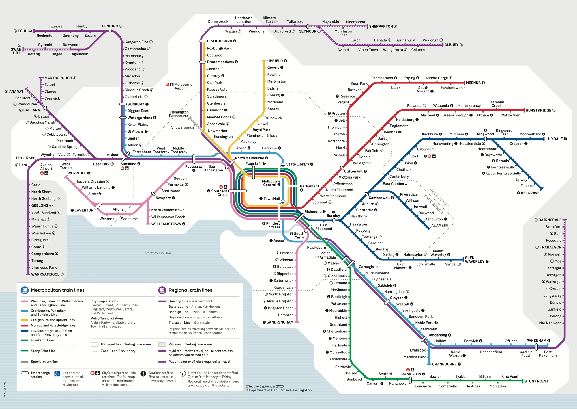
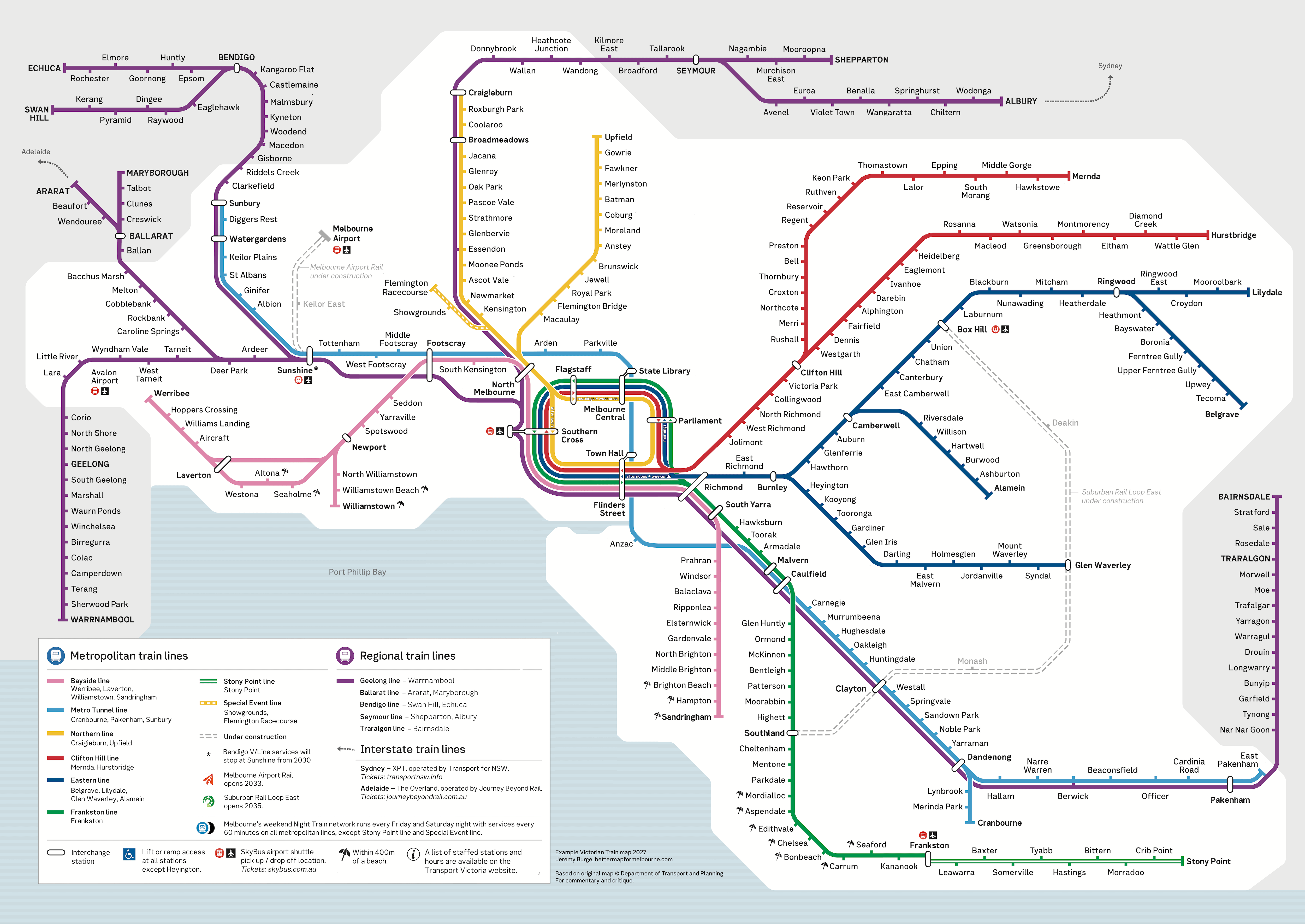
Above: the official train map from Transport Victoria (left), and the same map with changes proposed for improved clarity and way finding (middle).
Changes
South East Track Layout
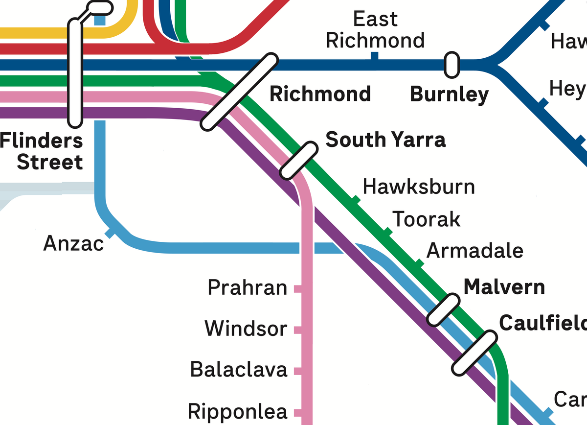
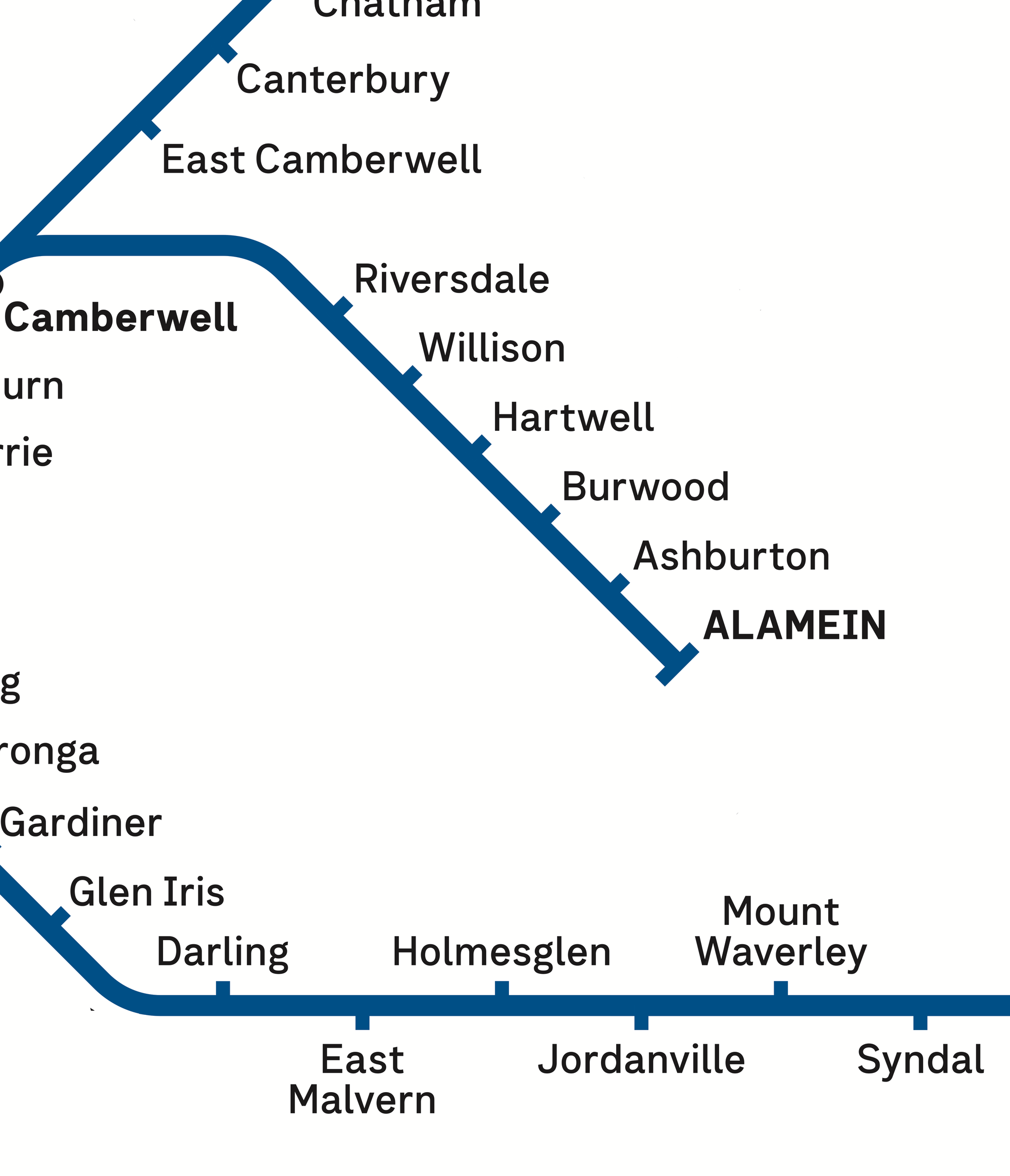
First there's the south east, where the Gippsland Line (purple) crosses over the light blue Cranbourne/Pakenham line at Caulfield, then again at South Yarra.
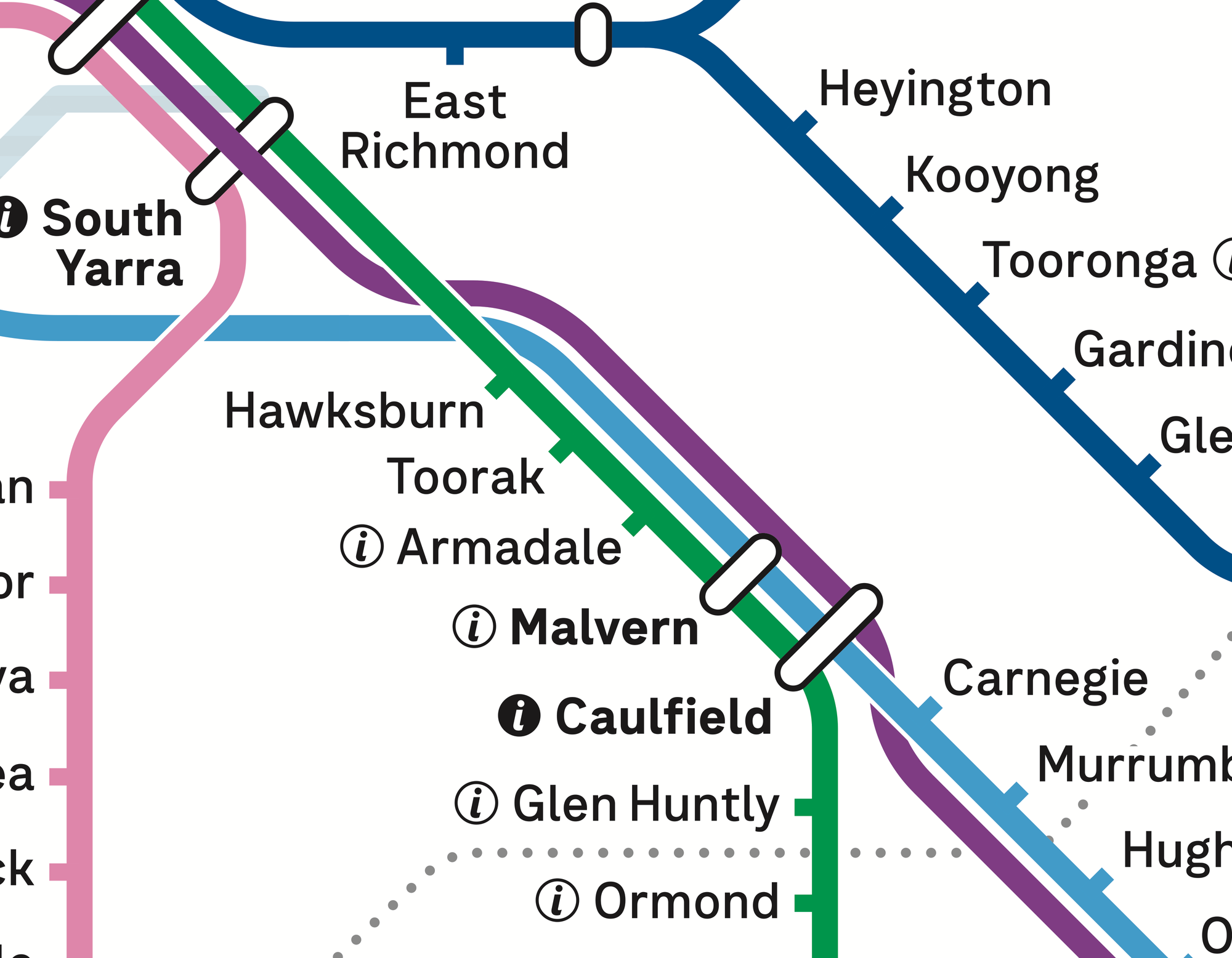
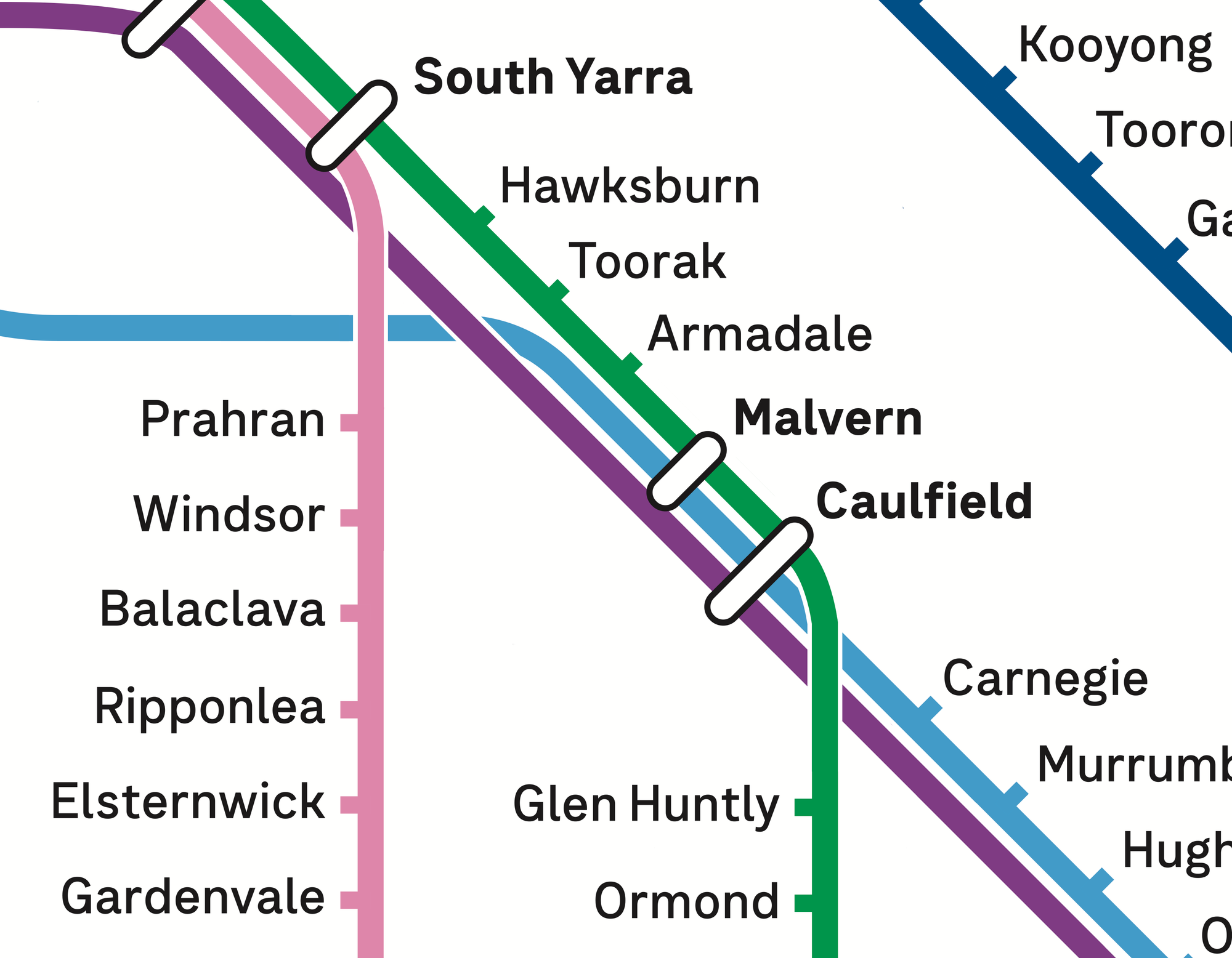
Above: Official map from Transport Victoria (left), and some proposed changes (right).
At South Yarra, the purple V/Line service can be seen displayed over the top of the station interchange lozenge, to indicate that trains from Gippsland don't stop there.
While that's somewhat clear, it does look a bit like a rendering error.
If possible, better to arrange lines that do interchange - eg the Sandringham line and Frankston line - so the lozenge can group two of three, without an odd line in the middle.
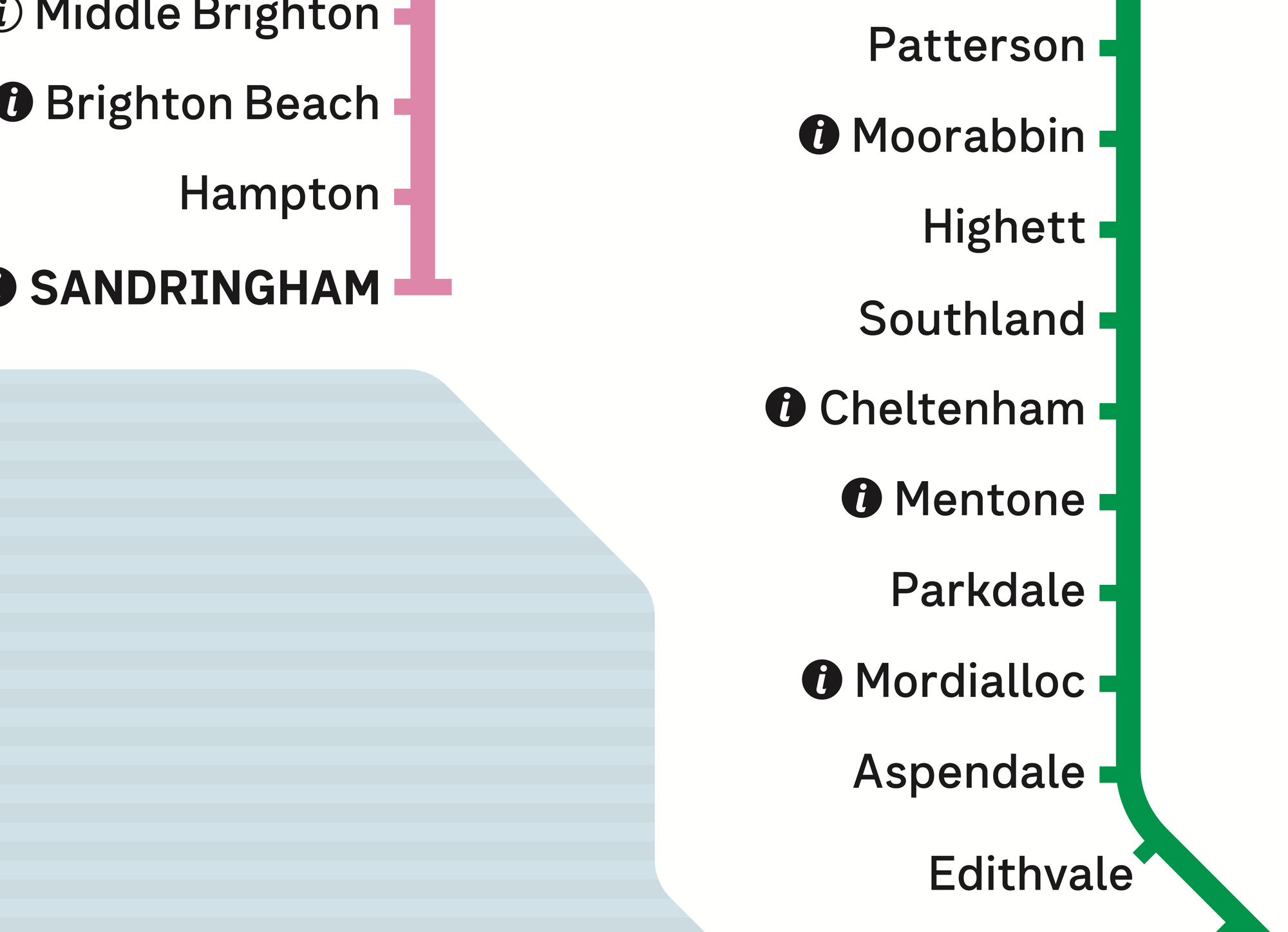
As a bonus to this layout, the Sandringham line (in pink) can be straightened.
Removing staffing markers
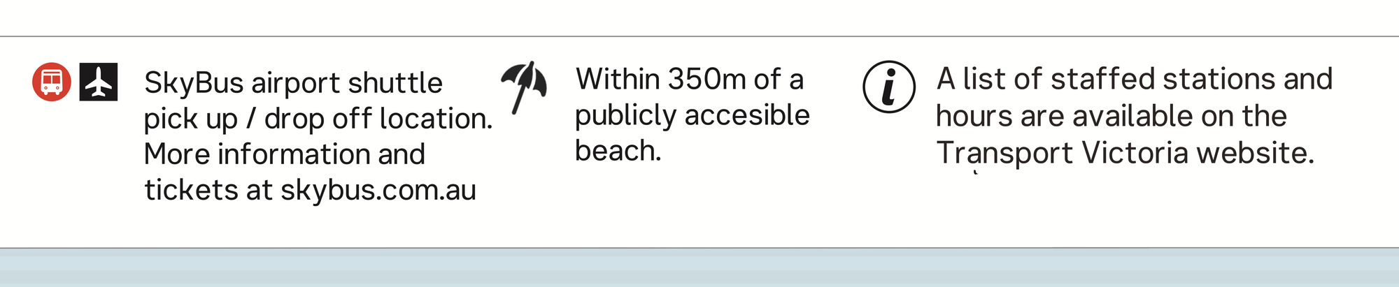
It's also clear from this example how crowded the ℹ️ markers are showing which stations are staffed full, or part time. Given the map is primarily for way finding, having a separate map and list with staffing hours and stations would be a better trade-off.
More importantly: the current map doesn't show when Protective Service Officers ("PSOs", think transport police) are working and at which stations, doesn't show toilet locations or hours. Or details about lifts or escalators.
Luckily Melbourne stations all have (often non-compliant) ramps, except one station which is noted. But all of these are just as, or more important, than a customer service desk being open or not.
Unstaffed stations can and should display signage to the nearest staffed station.
In most cases, people need to get where they are going, and while there are valid reasons for finding a staffed station, those rarely impact travel.
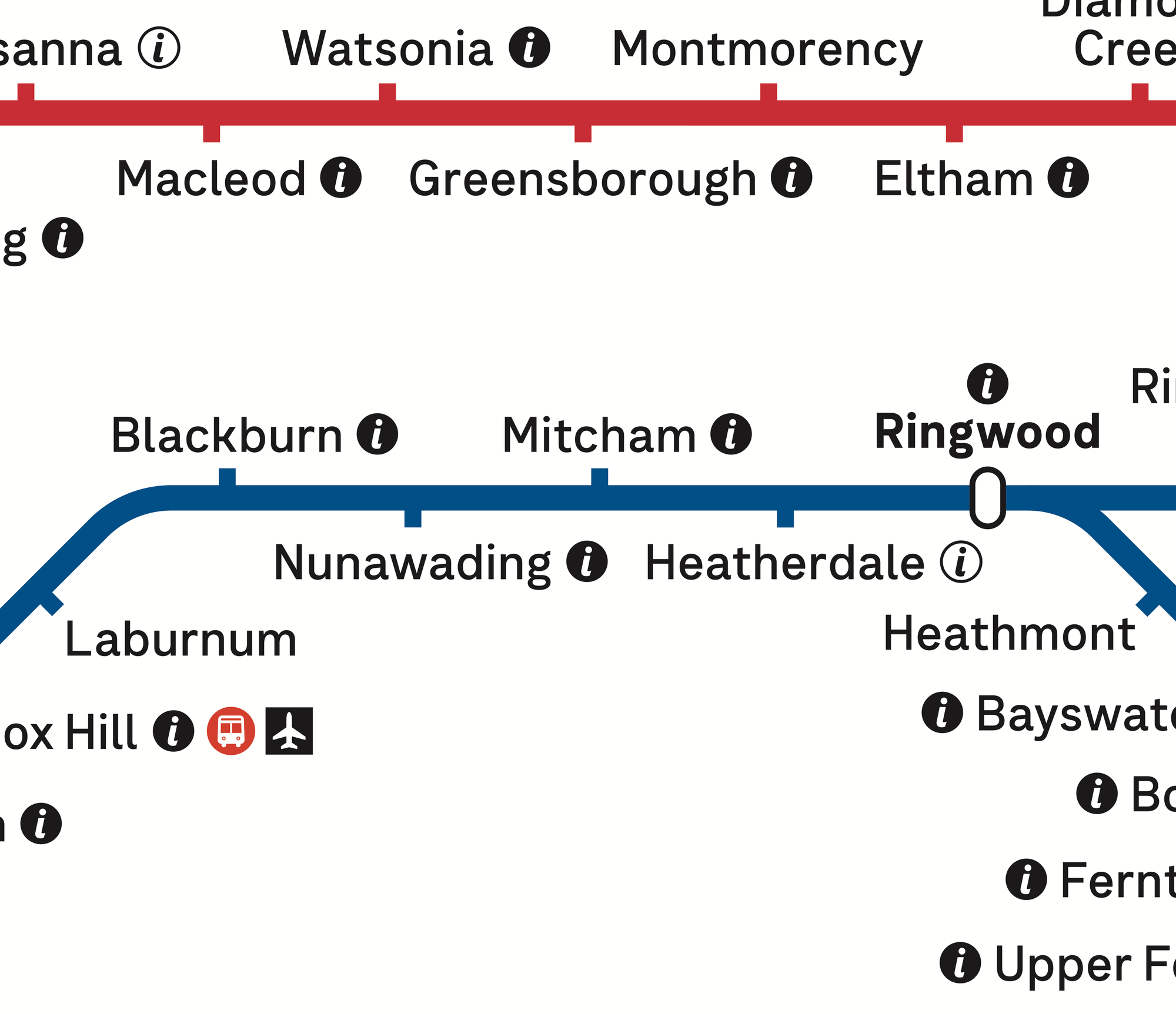
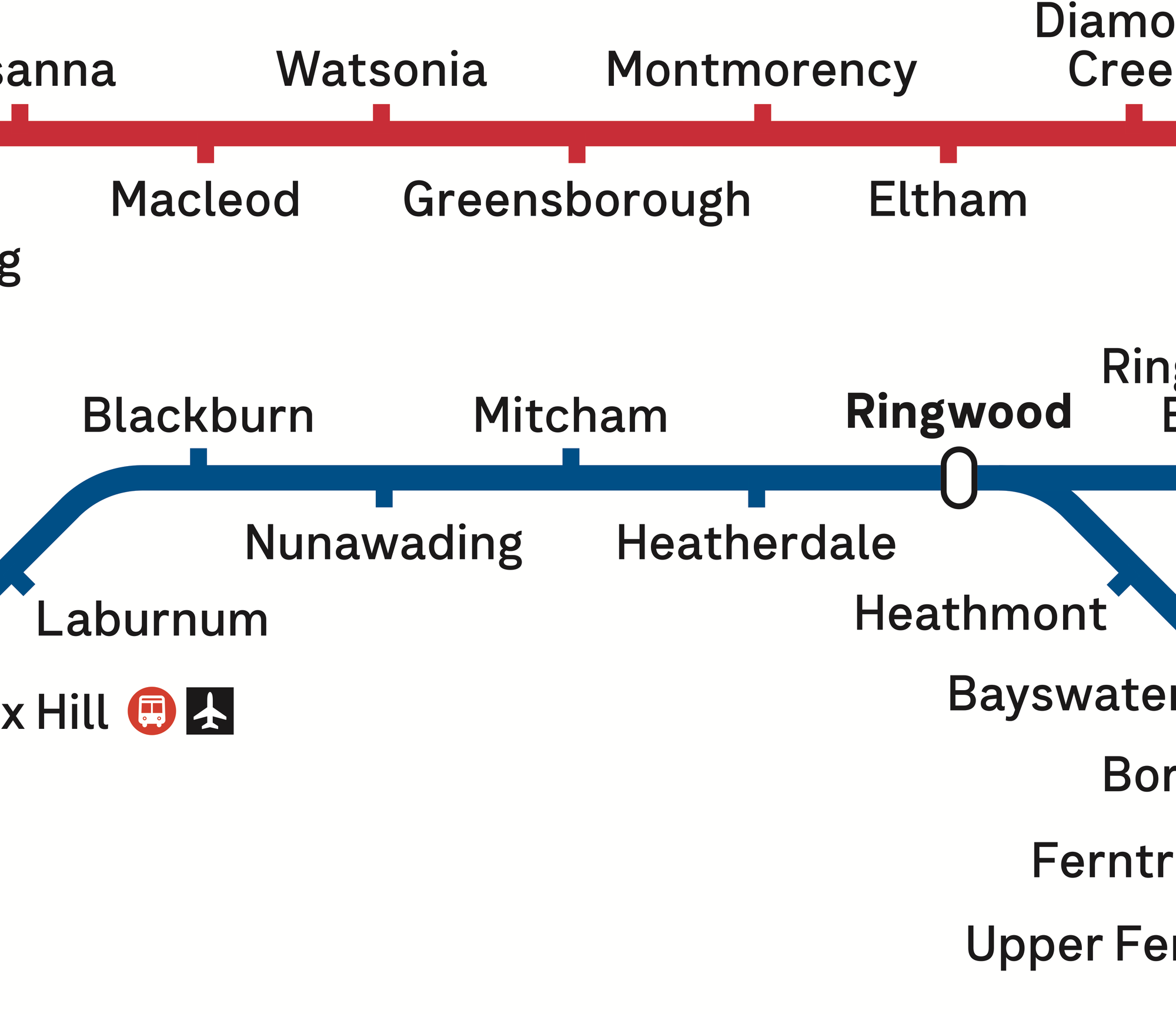
Above: Official map from Transport Victoria (left), and some proposed changes (right).
If you need to get to Armadale, you're going to go there, whether the station has staff or not.
A separate map with details of staff hours, PSO hours, toilet hours, would be very useful. It's just too much for the main train map.
It's hard to push against the status quo, and many would argue to leave these markers there because 'what is the harm in leaving them', but I'm aiming to look at what would be done if the network was new today.
Removing zone boundaries
Fares in Victoria are capped at $11.40 for unlimited travel daily, statewide. Single fares are marginally cheaper in 'zone 2 only' travel, compared to multiple zones. However this is also the case for various regional areas.
The official map shows a quite prominent zone 1/2 boundary line, despite it being relatively unimportant to travel in Melbourne. It also crowds a similar (but not identical) space to where the Suburban Rail Loop will be shown in future.
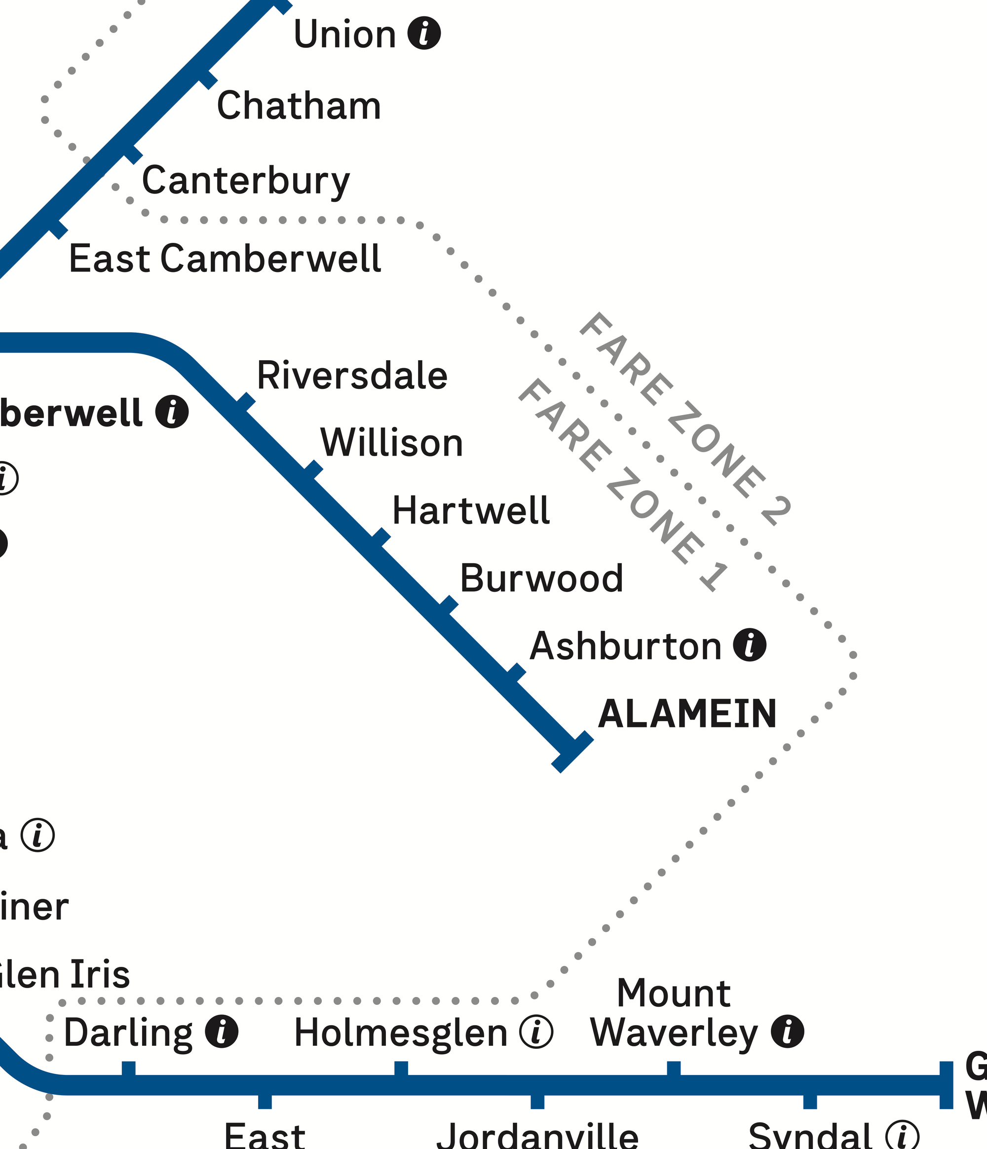
Above: Official map from Transport Victoria (left), and some proposed changes (right).
People who need specific fares information will still need to research online to find what the actual fares are, and often combine bus or tram with train travel, making the train-only map marker less relevant.
North of the city
A quick win here is straightening where services through the Metro tunnel rise up to ground level before arriving at Footscray.
Other changes have a greater range of trade-offs.
Above: Official map from Transport Victoria (left), and some proposed changes (right).
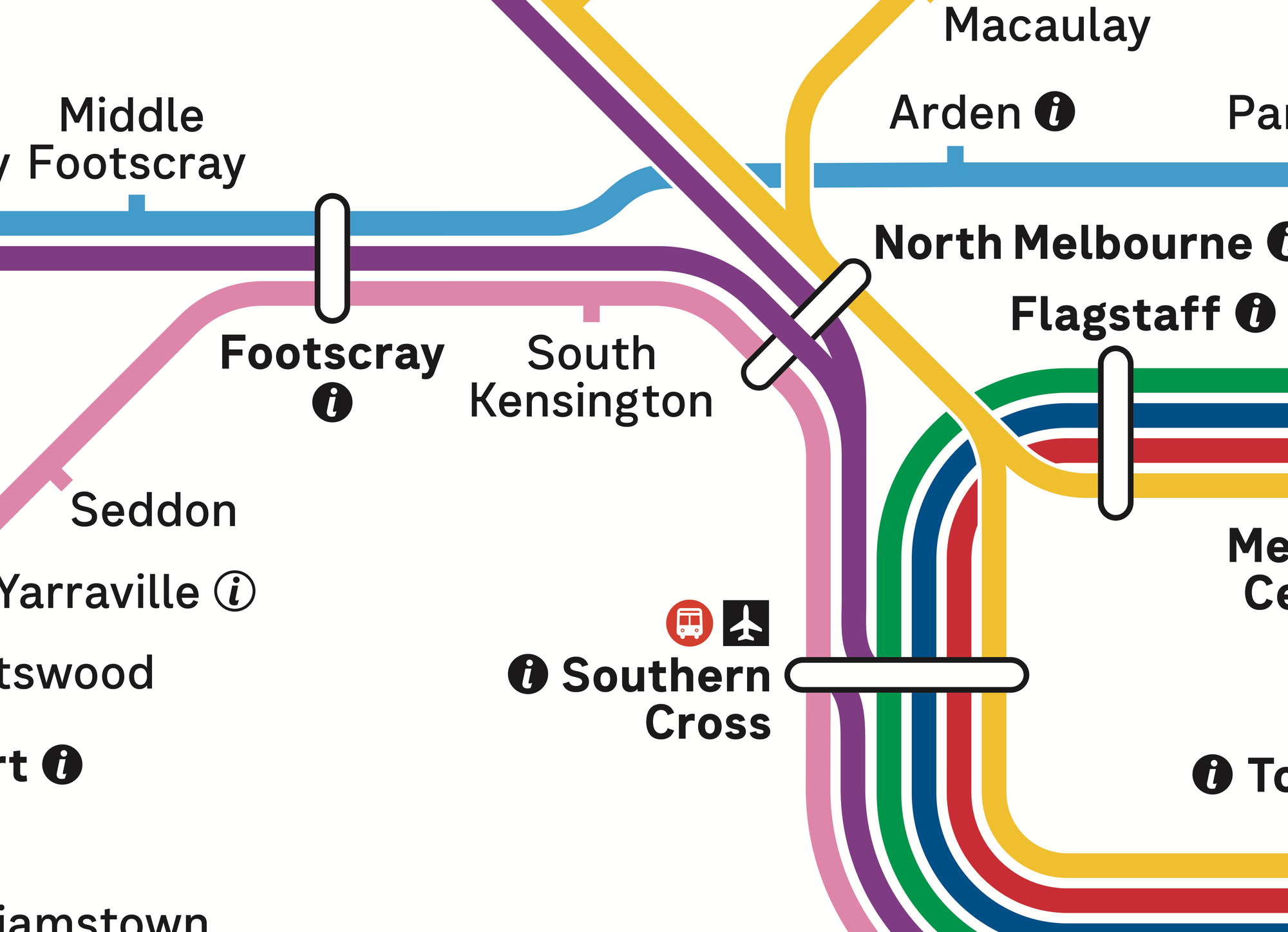
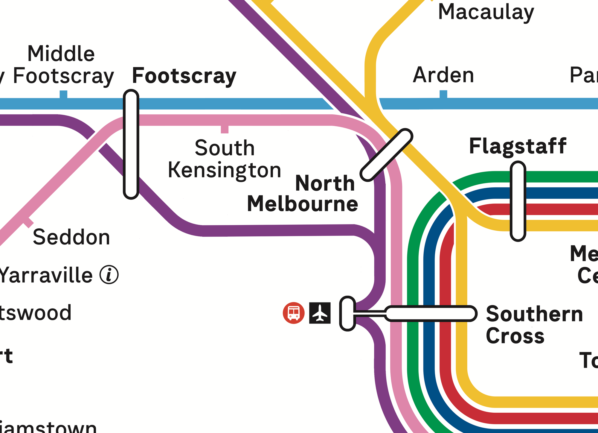
For example, routing the V/Line services from Bendigo and Ballarat around South Kensington and North Melbourne reflects the service pattern for these trains. They never stop at South Kensington, or North Melbourne, and no platforms exist for them to stop.
However the actual track does run right past the stations. So the proposed layout chooses clarity of journey over physical representation. It also avoids the aforementioned station-skipping line-over-lozenge at North Melbourne.
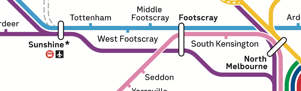
An updated version of this goes even further, showing the V/Line stopping at Sunshine, and then visually keeping a distinct path alongside stations it skips such as Tottenham and Middle Footscray.
Southern Cross
Arguably, this is the least necessary change. The existing map aims - reasonably successfully - to show that all V/Line trains terminate at Southern Cross.
This is achieved by a small bend to the track from the north and the south at Southern Cross. It's not perfect, but it's better than showing them in what would appear like services run from Gippsland through to the north and west.
I'm going out on a limb with this alternative design which somewhat blurs the line between the Southern Cross coach station and V/Line services, without expressly declaring that.

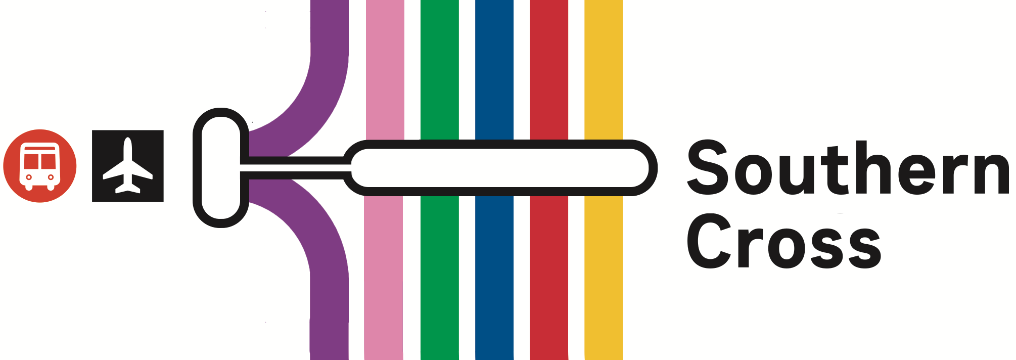
Above: Official map from Transport Victoria (left), and some proposed changes (right).
By leaving the SkyBus icons grouped next to V/Line terminating services, there is an implication that those services all start and stop at Southern Cross. Unlike the rest of the metropolitan lines, which run through in at least one direction.
The tradeoff is it's visually busier, and is inconsistent with how the same style of interchange groups Metro tunnel stations with City Loop stations.
I'm not sure I'd back this for the official map, but I do think there is something to be said for the goals.
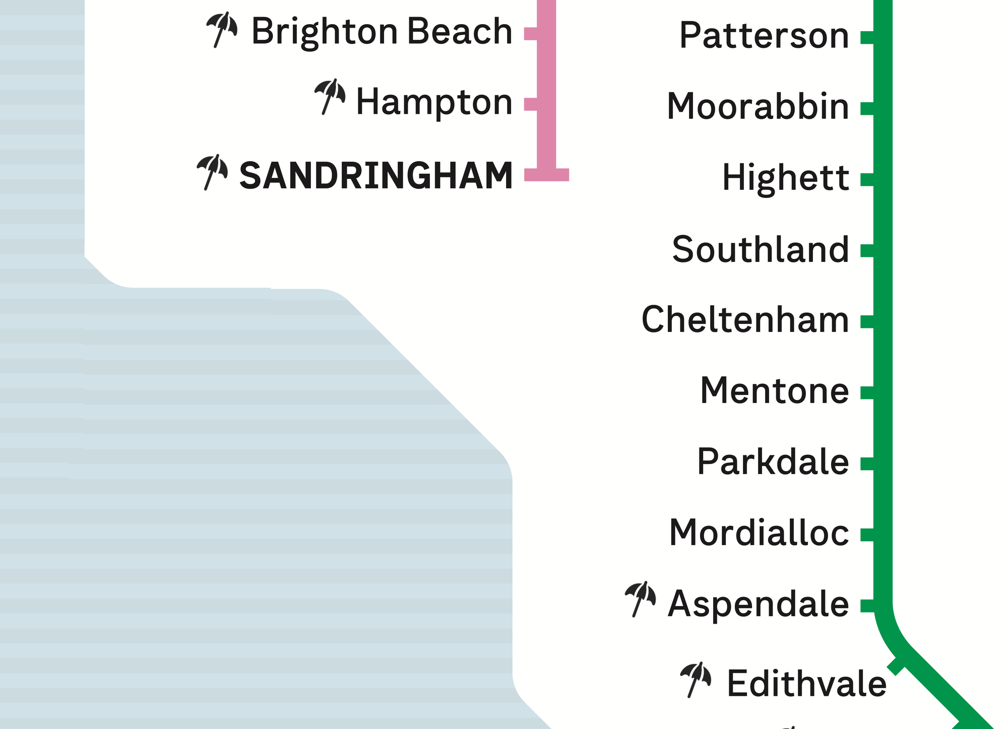
The Beach!
Any map is a set of trade-offs between information density and simplicity. If every station showed tram and bus interchanges, staffing hours, facilities, fares, and more – the map would be a mess.
However maps are also a symbol of a city. The tube map is an iconic part of London, as is the MTR map in Hong Kong. These are cities which are proud of public transport being woven into the fabric of the city.
Melbourne traditionally hasn't been great at putting public transport at the front of its branding. We love putting trams on postcards, but there's no single person in charge of ensuring a great passenger experience for new and old.
In my opinion, a lovely aspect of Melbourne's train network is how many beaches are directly and very easily accessed by train. Many literally overlook the beach. Multiple have 'beach' in their name!
Above: Should Melbourne have a beach icon on it's train map?
So why not use some of this cleaner map layout to give people an idea. You CAN get to the beach by train, these are all a five minute walk or less.
Where to draw the line is difficult, but I felt 350m was a sweet spot that included most genuinely easy to access beaches. Though it does exclude a few that are 1km or less such as Frankston, or Mordialloc.
Above: Official map from Transport Victoria (left), and some proposed changes (right).
This isn't my own idea, I first saw this on a train between Faro and Olhãu in the south of Portugal, and felt it relevant for locations where direct beach access exists from trains.
Nothing in isolation
More important than any changes to the map is service frequency, clean and accessible train stations, and more ways to easily access stations by bus, tram, walking or cycling.
This list of proposed map changes doesn't change any of this. It specifically uses the current operations, and makes different decisions about what to display, and where.
Some changes have been deliberately overlooked. Sunshine station also has an express-running V/Line track, but this with the upgrade to Sunshine station, all Bendigo line V/Line services will stop there from 2030.
I would also suggest V/Line services also stop at South Yarra, now they will pass a now-empty set of platforms, vacated by Cranbourne/Pakenham trains using the Metro tunnel instead. However that's not shown on this map, as there are no public plans to do so.
Coming soon...ish
Displaying train lines under construction can be a mixed bag. It doesn't help anyone using the map for journey planning today. But it does illustrate quickly to regular passengers, that there are new trips that may have once been slow or impractical that will soon* be fast and easy.
The main point of contention is when to start showing a line under construction on the map.
For changes with minimal navigational changes, such as the electrification of the Melton line, I would think this not worth the visual clutter to be added.
For new destinations and connections, such as Melbourne Airport Rail and Suburban Rail Loop East, these are worth including for at least a few years ahead of their completion.
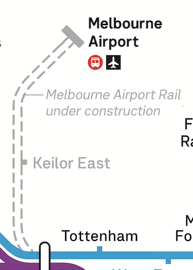
Which puts them on the map sometime between 2028 and 2033.
So this one jumps the gun a bit for a proposed 2027 map. But with lack of power comes lack of responsibility.
This is a clean version of Suburban Rail Loop East which makes assumptions about station names, not yet final as of early 2026. "Monash" for the station at Monash University, and "Deakin" for the station opposite Deakin University.
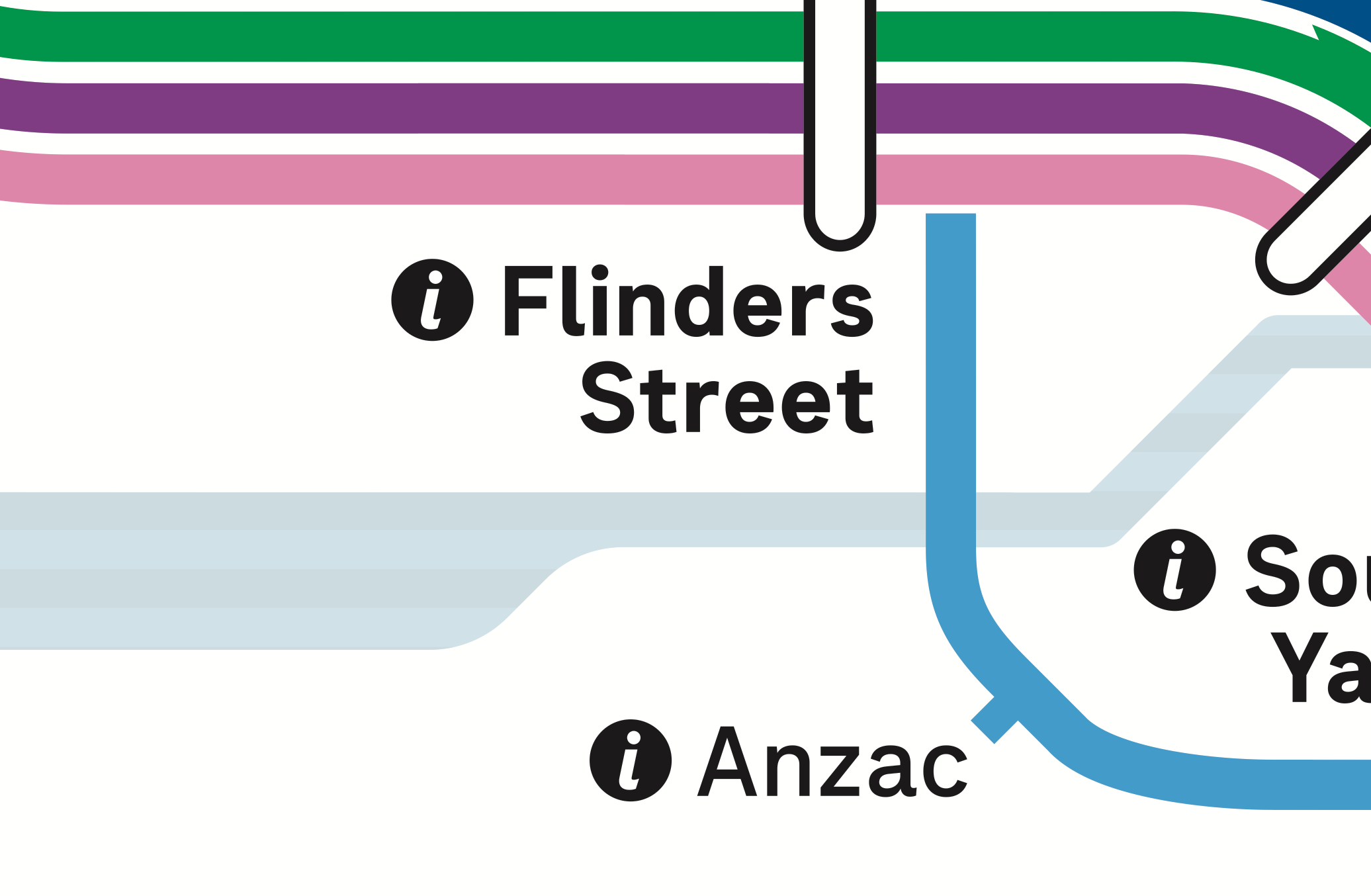
This map also assumes the station in walking distance of Southland station will be called Southland. None of these are a given, especially if the new Metro Tunnel stations of Town Hall (a short walk from platforms at Flinders Street) and State Library (even shorter walk from platforms at Melbourne Central) are any precedent.
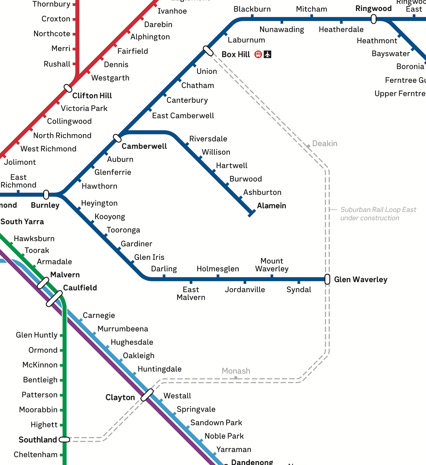
Given that only Clayton is confirmed to have a direct interchange without tapping out and back in, it's likely that other stations will be displayed as multiple station interchange lozenges ala Flinders St-Town Hall and Melbourne Central-State Library.
I'm of the view that for an under-construction line, it's fine to show a simpler version, and add detail like that closer to the line opening.
* yes 2033 is not soon at all
One final change
The train map makes a half-hearted attempt at showing Port Phillip Bay, which is a useful way to get one's bearings in a city which hugs the bay.
However the Yarra River could at best be useful for way finding around Flinders Street, which overlooks the river. By Richmond and South Yarra, it's no longer a useful metric. The river can't be seen from either station, and there's no connecting ferry services.
Above: We love the Yarra, but it could stop in the city. On the map at least.
This isn't a critique of individual designers. Designers are often restricted by how the network works, past decisions, and trying to appease too many stakeholders.
Melbourne's train map will continue to evolve, especially if the City Loop Reconfiguration ever gets the go-ahead, however that doesn't mean we shouldn't sweat the details today, and give it a fresh set of eyes.
A full version of this map, updated occasionally, is available at Better Map for Melbourne (dot com).